Friday, May 23, 2008

Balancing White Balance in our Heads

After you understand the inner workings of your camera, you see another knob/setting/button on your camera and you wonder what it is. It's white balance. White balance, like many other things, has its roots in film photography. White balance, as we will see, will also illustrate yet another way our eyes are superior to a camera.

One way the human brain keeps you on an even keel visually is adjusting your eye's own white balance. If it didn't, you would see things like a camera that had no white balancing capabilities would.

The big secret is... light (and white) isn't all the same color. The lights in your home, the sun, a cloudy sky, a scientific lab, a sporting arena.. all have output devices that produce very different kinds of light. The normal incandescent lights in your home are called tungsten lights. They make a very warm light. Warm in the photography world means a color that is closer to orange than blue. A midday outdoor scene makes a much cooler (blue) light due to the blueness of the sky reflecting on everything. This is why days that are heavily overcast are warmer than cloudless days. There is no blue sky (or very little) to bathe the world in blue light.


Sunsets
are typically very warm. The orange, yellows and salmon colors in a sunset cast a very warm light on the earth and can give everything a golden sheen.
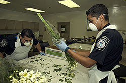


The scientific lab normally has overhead fluorescent lights. These lights give off a decidedly green color. Sodium vapor lights, HID, mercury halide lights can all put out differing colors of light as well. It is best to try to evaluate each of them on their own when that time comes.


Now that you know that all light isn't the same. Of course your next logical step is to wonder, how the scientists classified these different colors of light. Right?. .. Right?!? (crickets chirping) Ok, so maybe you didn't even think about that, but it's worth it to take a second to understand it. It might come in handy and if nothing else, you can really impress the babes.

As scientists are prone to do, they want to put numbers to things and figure out how to calculate the world. Someone decided they wanted to put numbers to the different colors of light. And made this really elaborate contraption that burned things and registered what color was produced as the temperature got hotter. Just like in a campfire (or blowtorch) the lowest temperature fire is a yellow and orange fire. And the hottest fire is a blue or indigo fire. The same is true with color. The lowest temperature light is an orange light the coolest, a blue.


One of the paradoxes of photography (and there's a few if you haven't noticed already) is that a light that is a low temperature is referred to as being warm. And a high temperature light thought of as being a cool light. Just keep warm = orange (like a campfire) and blue = cold (like those cool new Coors lite bottles)


You can see the different numbers on that scale and those numbers represent the temperature (in kelvin) of the light source that makes them. For example, a typical incandescent bulb is 2870 Kelvin. You can see from the chart that that is a very orange color of light. Daylight (and flashes) are estimated to be around 5600-5700 Kelvin; a much cooler color than the lights in your home.

A short list of other light sources:

Matches - 1700K

Sodium Vapor - 2100k

Midday Sunlight - 5600k

Xenon Short Arc - 6400k

Typical Summer Day - 6500

Blue sky - 12,000-20,000k


Having learned all this awesome information you can now begin to make some educated choices on the white balance of your camera. Normally you have these settings to choose from

Tungsten - usually represented by a light bulb
Daylight - represented by a sun
Cloudy - represented by a cloud
Shade - represented by a house with a weird triangle shade thing
Fluorescent - represented by a blinking bar looking thing.
Flash - represented by a lightning bolt

Of course your mileage may vary and your camera might have different pictures, but these are supposed to be intuitive, so in theory, i shouldn't even have to point these out!

Some advanced cameras (Like a Nikon D200) will let you choose your own Kelvin number for you white balance. This is useful if you know what you're doing. If you don't, stick to the pictures until you have a firm grasp of it or you have some specific reason for using a custom Kelvin number.

Another useful item is the white balance value that you can set yourself. If you are in a room with a mixed bag of lighting ( fluorescent lights on top, sunlight streaming in a window, tungsten bulbs around a beauty/makeup mirror) you might be faced with a whole cornucopia of light colors. None of your presets are going to be 100% correct. Your only real choice besides picking one and hoping for the best is to measure it yourself. (If pressed, I would choose the fluorescent in this situation because fluorescent light looks terrible with other white balances and i would hope this setting would be the lesser of all evils) You could buy a Kelvin reader for a few thousand dollars (hey get it from my sponsor Adorama! link on the upper right side) or you could get a white sheet of paper and make your own white balance setting.

To make a custom white balance reading and setting you will have to consult your manual as each camera is different. On my Nikon D50, with the camera active, you can hold down the white balance button and the PRE begins to flash. you then take a photo of a white card (a white piece of paper) and the camera uses that as its white balance until you change it. You can also take a photo and then go through a menu system on the camera to tell it to use that photo for white balance purposes. My Nikon D200 is a bit different in that you have to move the slider to PRE while holding the WB button down too. So, as you can see, each camera is a bit different in the details but all will produce the same results. This ought to at least get you in the ball park and keep those skin tones from looking like they are the next love interest of Captain Kirk.

Thursday, May 22, 2008

Whats a grey card? And how does my camera's meter work?

One of the most misunderstood items in photography is the grey card and how to use it. Some even debate whether its useful in the digital age. Quietly there's also been a big debate on what grey percentage the card should be.

One such person who suggests that the whole grey card percentage is off is the well respected Thom Hogan.
His contention is that the roots of 18% grey being 'half way between white and black' goes back to the print industry. That the printing industry determined that visually, a block printed with 18% black coverage looked half way between white and black. That's fine. We can assume that's true.

He also contends that Ansel Adams was the major mouthpiece many years ago convincing Kodak to use 18% for their grey cards instead of the hotly debated 15% and 12% grey.

what does all this mean to you? Well it depends. If you go with the flow of the world, it doesn't mean a lot. 18% will get you close to a correct exposure regardless. You'll be slightly underexposed but that's not the worst thing in the world. Of course, 18% could be the way to go and all the other talk is wrong.


I mean, can you even tell the difference between the three?

So, with that bit of uncertainty out of the way, why do you need a grey card? Your camera sensor sees in luminance. Luminance is defined as:

Optics. the quantitative measure of brightness of a light source or an illuminated surface, equal to luminous flux per unit solid angle emitted per unit projected area of the source or surface.

Whats that mean? well, everything (nearly) reflects light. Light from the sun.. Light from a flash.. Light from a street lamp.. Before the advent of color film, black and white film only measured luminance of objects. Red and Green could have the same luminance and would look identical on the black and white photo. This is similar to what your sensor does when it determines what the luminance of a scene is. It takes all the color in the scene (as long as you're using matrix metering) and figures out how to make that exposure fit the typical scene programmed into its memory. According to generally accepted thought, most scenes in nature average out to an average luminance of 18% grey. (Thom contends that Japanese engineers who design and build Nikons disagree, but that's beyond the scope of this entry)

Now, will all scenes you photograph average out to 18% grey? NO! Will the camera try to tell you that you should expose every scene to 18% grey? YES! The camera is a 'dumb device'. It can't think. It can't evaluate a scene. It doesn't even know what the subject of your photo is. Therefore, left to its own devices it will do what it is told to do. And unless you intervene, it will decide that a scene should be 18% grey and will suggest an exposure to fit that range.

This thinking by your camera sensor is a problem in a number of scenarios. One of these scenarios is snow. A scene with a large amount of snow (something that is nearly white) makes the camera think that, in general, the scene is very bright. It will suggest you either, raise the shutter speed, stop down the aperture, or lower the ISO (in digital cameras). Should you? maybe. Doing what the camera thinks you should do will cause the parts of your scene that aren't snow to be underexposed. They will be darker than they should be and the detail of those items could possibly be lost. This goes back to our discussion of dynamic range. You, the living thinking human, have to decide what is important and what is not. If you want white snow, take the exposure that makes your snow white. This will undoubtedly blow out the highlights in the snow. But, this is the trade off you have to make. If you want to show the details in the snow, you will have to underexpose the snow to make it more grey. The trade off, as we mentioned, its an unnatural darkening of the non-snow items in the scene.

The same sort of rules go for night exposure too. Lets say you wanted to shoot a photo of the night sky. If you pointed the camera up at the sky, it would see a majority black. It would determine that, for a proper exposure, you would need to open the shutter more, have a longer exposure, or raise the ISO. If you wanted to show the black of the night sky as black, the camera's thinking would be incorrect. If you figure that 10% of the scene is brightness from stars and 90% of the scene is black, then you would have to compensate for that in your exposure, despite what the camera tells you is 'right'.

So how can you tell the camera to expose a scene correctly? One way that's been used for many many years is the grey card. If you point the camera at the grey card (and fill the viewfinder with said grey card) your camera's brain will think, OK, how do i make this scene 18% grey. That's a good thing because the card IS 18% grey. Now once you get that exposure, you can use that setting to accurate render the real scene behind the grey card.

Is it really that easy? almost. The only caveat is that the grey card has to be getting the same sort of luminance from whatever light source is lighting your subject. If its a landscape photo, you will be using the sun as your light source. So the grey card needs to be in the sun getting the same exposure as the scene. If your subject is in the shade, you will need to have the grey card in the shade.

Do you point the card directly at the camera? Not really. General consensus is to split the difference on the angle between the camera and the light source. If the sun is 90 degrees to the left of your scene, and you are looking at the scene from straight on, then you would position the grey card at 45 degrees to get your reading.

Hopefully this clears up a little bit about how the camera's sensor works and now you can understand how sometimes the camera is wrong and how you, as the human operator, need to make decisions about the scene that the camera simply cant do. This is yet another reason why you need to get the camera out of automatic mode and take control! Your photos will thank you!

Wednesday, May 7, 2008

Hissy The Histogram

Now that we are in the digital age, how can you tell if your picture is exposed properly? In years gone by, you would have to rely on your light meter and experience and hope for the best in the darkroom. There were various things you could do in the film room to help yourself out in a pinch when mistakes were made. Today, we have different methods for review and confirmation that our photos came out the way we intended them to.


Introducing Hissy the Histogram. Hopefully your camera has something similar to it. This is a quick and dirty guide to give you some information about the exposure of the image you just took. You might have to read the manual to learn how to activate this screen on your LCD first. Once you've got that down you can begin learning a little bit about what it means. Think of the Histogram as a graph comparing two different concepts, one on the horizontal axis and one on the vertical axis.

The Horizontal axis is the relative brightness of the image; dark being on the left side of the graph and light being on the right side of the graph. If any part of the image is too light you will see that represented on the last pixel on the right side of the graph. The same concept in the reverse applies to underexposed parts of the photo. The vertical axis of the graph represents the relative amount of pixels found at that brightness. Taking the blue graph as an example, you can see two blue humps in the graph. This means there are more of those two 'brightnesses' in the photo than there are any other brightness. Overexposure is represented as the last pixel. You will remember that after you get past your camera's dynamic range, everything will appear white or black.

The higher end cameras will show four separate histograms. One for the overall exposure, one for the green channel, the red channel, and the blue channel. Lesser cameras will show only the overall exposure of the image. The overall exposure is less useful than the broken down histograms but it should only be treated as a rough estimate only.

Photos can be exposed in any way you want them to be exposed. Just because you have a majority of pixels underexposed so much that they're outside the dynamic range of the camera (or so many overexposed that they're also outside the dynamic range) it doesn't mean the photo is bad. High key photos, for example, will have a lot of overexposure. As long as the photo came out the way you wanted it to, that is fine. The histogram is just a tool in your tool bag. It isn't gospel and shouldn't be treated as such. That said, it can help you take better exposed photos if you're just starting out.

Thursday, May 1, 2008

But Mom, it didn't look like that to my eyes.

How many times have you said, "if only my photo had looked exactly as good as it looked when I looked through the viewfinder"? Sadly, the film and camera sensor industry hasn't been able to match what mother nature has invented when it came to light sensing equipment. One reason photos don't come out as they appear in the viewfinder is due to a limitation of the film or the sensor. The eye is capable of seeing both very bright things and very dark things in the same scene and determining detail from both. This concept is called dynamic range.

Webster's defines dynamic range as:

Main Entry: dynamic range1
Part of Speech: n
Definition: the ratio of a specified maximum possible level of a parameter to the minimum detectable or acceptable value of that parameter

And expressed another way:

dynamic range –noun Audio. the ratio of the loudest to faintest sounds reproduced without significant distortion, usually expressed in decibels.

This audio definition is good enough for the photographic arena as well with a few term modifications. Instead of the loudest to faintest sound it would be brightest to least bright light. It is commonly accepted that the eye has a general dynamic range of around 20 stops. Remember that any one stop is 100% brighter than the stop below it. That means that the eye has an extraordinary ability to see all the different intensities of light in a scene. Film has the ability to see around 7 stops of light in a scene and camera sensors have around 5 stops of ability.


While this will no doubt improve over time (sensors anyway, there is probably not going to be much in the way of research dollars going into film technology anymore) at the moment it forces you to make decisions about the scene you are looking at. You must decide what the important part of the scene is and make sure that range of stops is properly done in your photo.

Now that you know this, how can you combat it? Knowledge my friend. As mentioned before, you must make some decisions about what is important and what is not. You must make sure your subject falls within your dynamic range in order for it to be seen properly. In addition to that, you can "compress the dynamic range" by making brighter things darker through the use of neutral density filters. Alternately you can make darker things lighter though the use of strobes. We'll explore those concepts in depth in a later entry just as long as you have the concept down for now.

Wednesday, April 30, 2008

How does my camera sensor work?

Before we can continue our exploration into what exposure is, and how to get more out of your camera, we have to hash out a few issues. These issues revolve around what the eye can discern when looking at a scene and what the camera can discern when looking at the same scene. This entry will revolve around the difference between the two and some of the why behind it.

The eye is truly a wonderful instrument. It has a dynamic aperture and can recognize billions of colors. Through evolution the eye has been attuned to certain colors better than others. The human eye is more sensitive to green than it is to red. This makes sense because our world is more green than red. Having a hypersensitivity to green would have helped man to hunt. It's no wonder that the Nikon D200's sensor is "CFA Pattern: GREEN RED BLUE GREEN". 50% of your camera's sensor is capable of only reading green!

This is what a cross section of your sensor would look like:


This is what it would look like if you could see the light coming through your lens and striking your sensor. The light passes through your lens, past your shutter, and is filtered by colored filters on top of each pixel sensor. The filter only absorbs one color in the light spectrum and this is recorded onto that pixel.

So, if this is true, why isn't your picture nothing but red blue and green pixels when you zoom in far enough? The camera's brain reads the intensity of the color from each sensor and determines how intense it is in comparison to its neighbor.

For example. If you shot a picture of a nice green lawn, the light would be hitting the sensor and the green sensor would be getting a lot of light intensity. The red would be getting next to nothing and the blue a small amount also. The camera, would compare these three values and say, "this is mostly green" and would blend the color through all the neighboring sensors. This process is called interpolation and is common in all sorts of image manipulation. The downside of interpolation is that it will soften the focus of your image. this is why people will sharpen their images in photoshop before printing, to offset some of the softening that the electronic sensor automatically does when determining proper color representation.

The next lesson will explore why your eye can see more than your film can record.

Tuesday, April 29, 2008

Exposure in the film and digital age

In previous lessons we learned how the camera figures exposure and how to adjust it to get the sort of exposure you want. ISO, shutter speed, and aperture make up the bulk of the knowledge needed to put exactly as much light on the film (or sensor) as you want. Now that you know that, what else do you need to know about it? You need to know it all depends on the sensor you're using.

Camera sensors between manufacturers and even between models from the same manufacturers aren't the same. Some may read a little hotter than others while some might be a little warmer (orange) or cooler (bluish). Some sensors even interpret light intensity a little differently than others. How does this affect you? Let's consider a few facts first.


The typical photograph is a mix of light colors, medium colors, and dark colors. In the age of film people used to think a perfectly straight line between the colors was the holy grail of photography.


The typical photo of the day was more of an S curve. In layman's terms this means that parts of the photo that were lighter than the average brightness are slightly over exposed. And parts of the image that were slightly darker than the average of the photo were lightly underexposed. This is commonly referred to as being "crushed". Once people had the technology that allowed them to make a perfect linearly exposed photo, they learned that they didn't like how it looked! The holy grail was useless! It seemed dull and grey and not very eye catching. This S curve is called contrast, and the human eye likes a certain amount of contrast in an image. Most, if not all, digital cameras will automatically render your photos in this manner so, you don't need to worry about it. But it is good information to know as the more you know the more you can control the output of your own photographs.

Lets look at the effect of it on this photo of the chicken.

This is a photo of the chicken using a linear exposure:


You can see the straight line on the right side. (You can also see the histogram. This is something we will get into in a later lesson) Now compare that photo to the one below.


This is the same photo with the highlights and shadows a bit crushed:


Now, you can see the line isn't straight. It is a bit curves, and you can see the result in the colors when compared to the linear photo. Both of these images came from the same image out of the Nikon D200. With this in mind, overdoing contrast is as bad as underdoing it. Keeping in mind the mantra, "all things in moderation," and you'll be fine.

The next lesson will be reading, understanding and interpreting the histogram. Your on camera tool for good exposure.

Friday, April 25, 2008

Shutter Speed. The Last Leg of the Exposure Race

In previous entries we discussed the uses, shortcomings and merits of the other two parts of exposure: aperture and ISO. Both of those two variables are crucial to being able to master your own exposure needs, and to create what is popping into your minds eye. The last consideration of exposure, from a technical sense, is shutter speed.

Shutter speed is the speed in which the shutter opens and closes. In the pipeline analogy of previous lessons, Shutter speed is the time that elapses after you turn the spigot on and when you shut it off. In photographic terms, this could be between 1/8000th of a second and a few hours time. Of course there are photos who exceed both of those ends of the time continuum but they are pretty rare at present.

In the same way that going up another step in ISO and opening your aperture one stop can allow you to change your exposure in a precise manner, halving your shutter speed can precisely reduce your photographs exposure by one stop.

Below are typical shutter speeds by full stop change:

* 1/1000 s
* 1/500 s
* 1/250 s
* 1/125 s
* 1/60 s
* 1/30 s
* 1/15 s
* 1/8 s
* 1/4 s
* 1/2 s
* 1 s


(There is something called reciprocity failure that prove these rules untrue, but it goes back to when you re making photos that are either very very long or very very short. So for the sake of these discussions, it won't be addressed)

Now that you know that, you might be wondering how shutter speed affects your photography. The answer is, it depends. Not only does shutter speed affect exposure, but it affects how blurry or sharp your photos are. Pick a shutter speed that is too low while you try to hand hold your camera and your photo will be 'soft' or even flat out blurry.

How do you know what is a safe shutter speed? We will get into that in a later entry but for now, if you re shooting with a cropped sensor SLR (nearly all of them are) assume that if you are hand-holding your camera (no tripod, monopod, resting on a tree, etc) you need a shutter speed that is 1/1.5 times your focal length. Therefore if you are trying to shoot a photo with a 50mm lens you should maintain 1/75th of a second. If you have a 500mm lens, you should maintain 1/750th of a second, and so on. (my photography advisor recommends 1/x*2! making it 1/100!) Below are some examples The Bauer Gallery Chicken taken with different shutter speeds using a 50mm lens on a Nikon D200.


1/200th of a second @ 50mm


1/45th of a second @ 50mm


1/2 second @ 50mm


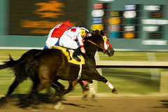
How else does shutter speed affect your photo? Well, perhaps your photo IS in focus but your subject is moving rapidly across the focal plane. This will result in a blurry photo, but, the main subject will remain sufficiently in focus. Below is an example of this effect. The subject remains acceptably in focus, while the background blurs with motion.

DSC_3201


Hopefully now you can begin to see the relationship between shutter speed, aperture, and ISO as it related to exposure. A full step change in one should be the same as a full step in the same direction from one of the other choices. In kind, a one step decrease in one, and a one step increase in another, should render a similar exposure as your original image. In following episodes we'll explore more of the camera and how to get yourself permanently out of automatic mode and taking photos that your friends and family (and maybe even clients) will be wowed by.

TBG